Fixing Hidden Anchor Links Behind a Sticky Nav with Just a Few Lines of Inline CSS
When you click a footnote link or a table‑of‑contents entry in a document, the browser jumps to the element with the matching #some-id. The element is positioned exactly at the top of the viewport. If you have a navigation bar that is position: sticky (or fixed) at the top, the element scrolls to the top but ends up hidden behind the nav bar.
This is a common front‑end issue, but it can be confusing for back‑end or full‑stack developers who wonder why the link worked but the content isn’t visible. In this post I’ll focus on the approach I use most often: adding a few lines of inline CSS to the problematic page. It’s the simplest, most immediate fix.
Why Does This Happen?

The browser’s default behaviour is:
- The URL changes to
…/page#target. - The browser finds the element with
id="target". - It scrolls so that the element’s top aligns with the top of the scroll container (usually the viewport top).
Because a sticky nav renders on top of the viewport, the element ends up underneath the nav bar.
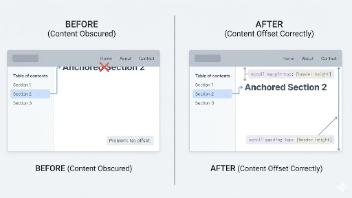
The Easiest Fix: scroll-margin-top (Add Space to the Element)
Give the element that will be scrolled to a scroll-margin-top. The browser will then position the element a little lower than the top of the viewport.
Minimal Inline CSS (Recommended)
Adding the following to the page’s <head> or template usually solves the problem:
<style>
  :root { --sticky-nav-h: 64px; } /* set to the actual nav height */
  [id] { scroll-margin-top: calc(var(--sticky-nav-h) + 12px); }
</style>
--sticky-nav-h: height of the sticky nav.+ 12px: a little extra space so the content isn’t right up against the nav.
Applying
[id]globally corrects every anchor on the page. If that feels too broad, narrow the selector as shown below.
Narrow the Scope for Safety
For example, only apply it inside the article body:
<style>
  :root { --sticky-nav-h: 64px; }
  .article [id] { scroll-margin-top: calc(var(--sticky-nav-h) + 12px); }
</style>
Or, if the TOC mainly links to h2/h3 elements:
<style>
  :root { --sticky-nav-h: 64px; }
  .article h2[id], .article h3[id] {
    scroll-margin-top: calc(var(--sticky-nav-h) + 12px);
  }
</style>
A Handy Complement: scroll-padding-top (Container‑Level Padding)
scroll-padding-top hints to the scroll container that it should keep a safe area at the top during scroll‑snap or fragment navigation. In practice scroll-margin-top is more intuitive, but combining them can increase stability for certain layouts.
<style>
  :root { --sticky-nav-h: 64px; }
  html { scroll-padding-top: calc(var(--sticky-nav-h) + 12px); }
</style>
- Useful when you want a quick, page‑wide adjustment.
- For fine‑grained control, stick with
scroll-margin-top.
Legacy/Compatibility Trick: Fake Offset with ::before
An older method is to insert an invisible block before the target element, pushing the real content down.
<style>
  :root { --sticky-nav-h: 64px; }

  .anchor-target::before {
    content: "";
    display: block;
    height: calc(var(--sticky-nav-h) + 12px);
    margin-top: calc(-1 * (var(--sticky-nav-h) + 12px));
    visibility: hidden;
    pointer-events: none;
  }
</style>
Usage example:
<h2 id="install" class="anchor-target">Installation</h2>
- Pros: Works reliably because it’s a pure CSS trick.
- Cons: Requires adding a class and a bit more selector gymnastics.
Today, try scroll-margin-top first; if you hit a corner case, consider the ::before trick.
JavaScript Workarounds vs. Inline CSS
You could also use JavaScript, e.g., scrollIntoView() followed by window.scrollBy(0, -navHeight). However, CSS is usually preferable:
- Static content pages with many footnotes or TOC entries.
- When you want a quick, page‑specific fix without touching framework routing.
- When the maintainer may not be a front‑end specialist.
A few lines of inline <style> are dependency‑free, easy to debug, and simple to roll back—ideal for documentation sites.
Practical Checklist
- Determine the sticky nav height – if it changes responsively, update
--sticky-nav-hat each breakpoint. - Avoid overly broad selectors – global
[id]is convenient but can be excessive; limit to.article [id]or similar. - Add a little extra space (+8–16 px) – it improves the visual feel; just matching the nav height can feel too tight.
Bottom Line: My Go‑to One‑Liner
Add the following inline style to the page that has the issue and you’re done:
<style>
  :root { --sticky-nav-h: 64px; }
  .article [id] { scroll-margin-top: calc(var(--sticky-nav-h) + 12px); }
</style>
This single snippet usually resolves TOC, footnotes, and deep links all at once. I hope it helps developers who are struggling with links hidden behind a sticky navigation bar.
Related Posts
- Why Specifying Width and Height on the Image Tag Matters
- Backend Engineers Should Know at Least This Much - Top 5 Frontend JS Methods and Modules


There are no comments.