10 Color, Stroke, and Shadow Combinations for Beautiful, Readable Subtitles and Titles
When creating subtitles or title overlays in Kdenlive, font choice varies, but readability depends largely on the combination of color, stroke, shadow, and a background rectangle. Below is a list of combinations I frequently use, each with a nickname and ready‑to‑apply values.
Reference: 1080p (Full HD). Titles should be larger and bolder, while subtitles can be slightly thinner for a natural look.
Quick Kdenlive Tips (Short and Practical)

- Stroke thickness
- Subtitles (small text):
2-4px - Titles (large text):
4-10px - Shadow
- Usually
offset 2-6px,blur 6-18px,opacity 40-70%works well. - Background rectangle
- When the video is complex, a semi‑transparent box is more reliable than a shadow.
- Commonly
black (#000000) 35-60%+ rounded corners. - Color selection principle
- Contrast (lightness difference) with the background comes first, not just “pretty colors”.
- In practice, bright text + dark stroke is the most reliable choice.
10 Recommended Combinations (Nickname + Settings)
The values below are starting points. Tweaking the thickness (px) and opacity (%) slightly based on the video’s brightness can significantly improve the result.
| Alias | Use / Feel | Main Text | Stroke (color/thickness) | Shadow (color/offset/blur/opacity) | Background Box (alternative) | Preview |
|---|---|---|---|---|---|---|
| Noir Pop | Most common YouTube subtitle | #FFFFFF |
#111111 / 3px |
#000000 / (3,3) / 12 / 55% |
None | Noir Pop |
| Cinema Gold | Movie trailers / highlights | #F5C542 |
#1A1A1A / 5px |
#000000 / (4,4) / 16 / 60% |
Black 35% | Cinema Gold |
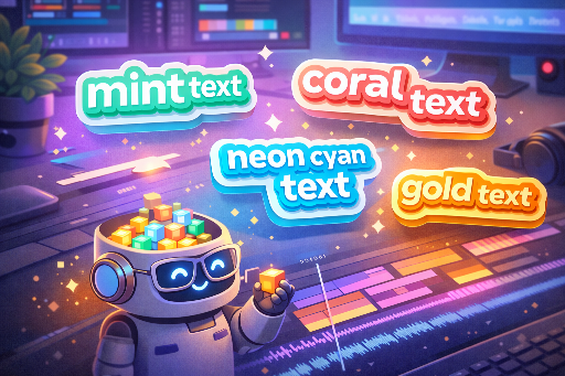
| Mint Tech | IT / tutorial tone | #38E8C6 |
#0B2B2A / 4px |
#000000 / (3,3) / 14 / 50% |
Black 30% | Mint Tech |
| Coral Punch | Shorts / reactions / variety | #FF5A6E |
#2A0B10 / 4px |
#000000 / (3,3) / 12 / 55% |
Black 35% | Coral Punch |
| Sky Clean | Bright vlogs | #EAF6FF |
#0B1B2B / 3px |
#000000 / (2,2) / 10 / 45% |
Black 25% | Sky Clean |
| Lavender Calm | Emotional / review / ASMR | #CDB7FF |
#1C1630 / 3px |
#000000 / (2,3) / 14 / 45% |
Black 30% | Lavender Calm |
| Neon Night | Games / cyber / night scenes | #00F5FF |
#0B0F14 / 5px |
#000000 / (4,4) / 18 / 65% |
None (use thicker stroke) | Neon Night |
| Paper Caption | Documentary / education / news | #F2F0E6 |
#2B2B2B / 2px |
#000000 / (2,2) / 8 / 40% |
#000000 45% (recommended) |
Paper Caption |
| Sports Banner | Highlight subtitles / keywords | #FFFFFF |
#0B0B0B / 6px |
#000000 / (4,4) / 14 / 60% |
Solid box (team color 55%) | Sports! |
| Minimal Graybox | Safe for any video | #FFFFFF |
None or #000000 / 1~2px |
Light: #000 / (2,2) / 8 / 35% |
#000000 50% + rounded |
Minimal Graybox |
Five Design Secrets for “Good Design”
-
Highlight only keywords with color * Instead of coloring the entire sentence, using a point color like
Mint TechorCoral Punchfor key words gives a more sophisticated look. -
A 1px increase in stroke feels significant * To boost subtitle impact, the quickest fix is usually adding 1px to the stroke.
-
For complex backgrounds, a box is more reliable than a shadow * n detailed scenes such as forests, cityscapes, or game UIs,
Minimal Grayboxis usually the safest choice. -
Different settings for top titles vs bottom subtitles * Top titles: thick stroke (4~8px), strong shadow. * Bottom subtitles: stroke 2~4px, box 40~55% opacity.
-
Don’t insist on white only * Warm indoor lighting or vlogs benefit from
Paper Caption(off‑white) to reduce eye strain.
Quick Selection Guide
- If you’re new:
Noir PoporMinimal Graybox - IT/tech vibe:
Mint Tech - Emotional / review:
Lavender Calm - Highlight / variety:
Coral Punch,Sports Banner - Games / neon:
Neon Night - Doc / education:
Paper Caption

There are no comments.