Introducing daisyUI: Rapid UI Creation with “Just Classes”
Tailwind CSS offers high flexibility through its utility classes, but repeatedly assembling components like buttons, cards, and modals can become tedious. daisyUI sits on top of Tailwind, adding component classes and a theme system that dramatically cut down design and styling time.
Installation and configuration vary slightly across frameworks (Next.js, Vite, Remix, etc.). This article assumes daisyUI is already installed. For a fresh setup, refer to the official installation guide:
What is daisyUI?

daisyUI is a Tailwind CSS plugin that supplies frequently used UI patterns as component classes. Instead of piecing together utilities for each button, card, or modal, you can simply use concise, meaningful classes like btn, card, or modal.
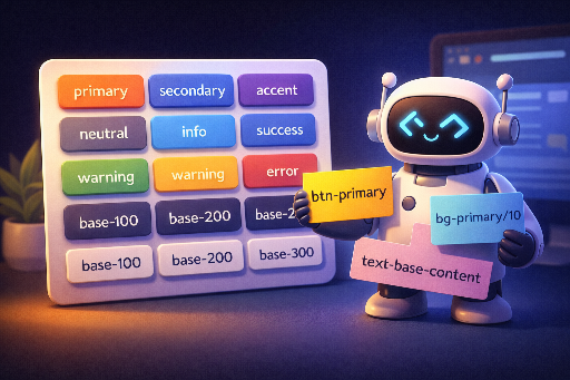
- Component classes:
btn,card,navbar,modal, etc. – ready to use UI patterns. - Theme system: Switch themes effortlessly with attributes such as
data-theme="light". - Seamless integration: Fine‑tune with Tailwind utilities when needed.
The most noticeable benefit is that the rendered output remains consistent while the HTML becomes significantly shorter.
Below, we compare the HTML for a “Primary button” and a “Card with action button” with and without daisyUI.
daisyUI vs. Plain Tailwind: Same Result, Less Code
1) Primary Button
(A) Using only Tailwind – you must combine utilities to style the button.
<button
  class="inline-flex items-center justify-center rounded-lg px-4 py-2 text-sm font-medium
         bg-blue-600 text-white shadow-sm hover:bg-blue-700
         focus:outline-none focus:ring-2 focus:ring-blue-500 focus:ring-offset-2
         disabled:opacity-50 disabled:pointer-events-none"
>
  Primary
</button>
(B) Using daisyUI – the same button expressed with a shorter component class.
<button class="btn btn-primary">Primary</button>
The key point isn’t that Tailwind can’t do it; rather, daisyUI bundles the repetitive utility combinations into a default style, letting you fill the screen quickly and then refine with Tailwind.
2) Card + Action Button
(A) Using only Tailwind – you assemble the card container, title, body, and action area separately.
<div class="w-96 rounded-2xl bg-white shadow-xl">
  <div class="p-6">
    <h2 class="text-lg font-semibold">Card title</h2>
    <p class="mt-2 text-sm text-slate-600">
      When you use the same card pattern in many places, the class list grows long and duplication increases.
    </p>
    <div class="mt-4 flex justify-end">
      <button
        class="inline-flex items-center justify-center rounded-lg px-4 py-2 text-sm font-medium
               bg-blue-600 text-white shadow-sm hover:bg-blue-700
               focus:outline-none focus:ring-2 focus:ring-blue-500 focus:ring-offset-2"
      >
        Confirm
      </button>
    </div>
  </div>
</div>
(B) Using daisyUI – the card’s role is expressed first, and Tailwind can be used for additional tweaks.
<div class="card w-96 bg-base-100 shadow-xl">
  <div class="card-body">
    <h2 class="card-title">Card title</h2>
    <p>
      daisyUI provides component classes for recurring UI skeletons, shortening the HTML.
    </p>
    <div class="card-actions justify-end">
      <button class="btn btn-primary">Confirm</button>
    </div>
  </div>
</div>
In summary, daisyUI:
- Reduces class length, improving readability
- Standardizes default values for recurring UI patterns
- Offers consistent styling, including themes
The next section explains why the theme system is especially convenient.
Theme System: Why Dark Mode and Brand Themes Are a Breeze
daisyUI’s strength lies in its theme switching. It supplies CSS‑variable‑based themes that automatically adjust colors, backgrounds, and text tones across the entire app.
Applying a Theme in HTML
<html data-theme="light">
  <body>
    <button class="btn btn-primary">Hello</button>
  </body>
</html>
Toggling Theme with JavaScript
const html = document.documentElement;

function toggleTheme() {
  const next = html.getAttribute("data-theme") === "dark" ? "light" : "dark";
  html.setAttribute("data-theme", next);
}
Benefits of this approach:
- Resolve color changes globally instead of per component.
- Quickly stabilize the design system (colors, tones) early in the project.
Using Tailwind and daisyUI Together
daisyUI is great for establishing a basic structure, while Tailwind fine‑tunes the details.
For example, add spacing, alignment, or responsiveness to a button with Tailwind:
<button class="btn btn-primary w-full sm:w-auto px-6">
  Save
</button>
btn btn-primary: component style (consistency)w-full sm:w-auto px-6: layout, responsiveness, fine‑tuning
When is daisyUI Especially Useful?
- MVP / Prototyping: Quickly build a functional, attractive UI.
- Dashboards / Admin Panels: Repetitive patterns like tables, cards, and forms.
- Small teams / solo devs: Limited time for a full design system.
- Services where themes matter: Easy dark mode or brand‑specific skins.
Things to Consider
- Class naming follows daisyUI conventions (
btn,card,navbar, etc.). Verify that this aligns with your team’s conventions. - Custom design needs: If your design is highly unique, the default component styles may feel restrictive. However, Tailwind utilities can usually override them, or you can redefine component classes.
Conclusion
daisyUI is a practical plugin that boosts Tailwind’s productivity. Thanks to its component classes and theme system, you can rapidly build UI and maintain consistent styling.
In the next article, we’ll explore:
- Choosing and customizing themes for your project.
- What daisyUI’s themes are and why switching them is so straightforward.
We’ll dive deeper into these topics.
There are no comments.