daisyUI Themes: End the Color Dilemma with 35 Palettes
daisyUI’s themes are more than just “dark mode support.” They provide 35 pre-designed palettes (themes) that are ready for production-grade UI color combinations and let you apply a single palette consistently across your entire app.
This article assumes the installation is complete. If you need to install first, check the official guide: https://daisyui.com/docs/install/
The Core of Themes: “Don’t hard‑code colors”

This is the most common point of confusion for beginners.
| Wrong approach | Result |
|---|---|
Using Tailwind classes like bg-white, text-slate-900, bg-blue-600 to set colors directly |
The element keeps its fixed color even when the theme changes |
In other words, to use a theme you must avoid hard‑coding colors and instead use daisyUI’s token‑based color names.
❌ Bad Example: Ignoring the Theme with Hard‑coded Colors
<div class="bg-white text-slate-900 p-6 rounded-2xl">
  <button class="bg-blue-600 text-white px-4 py-2 rounded-lg">Save</button>
</div>
✅ Good Example: Using daisyUI Tokens to Conform to the Theme
<div class="bg-base-100 text-base-content p-6 rounded-box">
  <button class="btn btn-primary">Save</button>
</div>
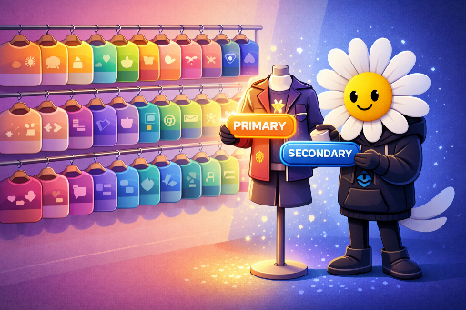
The key is not what color but what role the element plays.
bg-base-100: the default background for screens/cardstext-base-content: the default text colorbtn-primary: the primary call‑to‑action for the product
The theme swaps colors based on these roles.
So, What Should You Use?
To use daisyUI themes effectively, habitually use one (or both) of the following:
| Usage | Example |
|---|---|
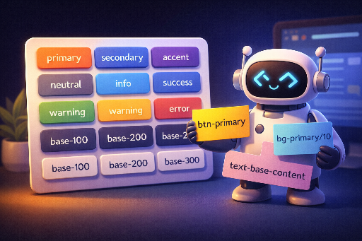
| daisyUI component classes | btn, btn-primary, alert, badge, card, navbar, input, … |
| daisyUI color token classes (meaning‑based colors) | Base background/text: bg-base-100, bg-base-200, bg-base-300, text-base-content |
Point colors: bg-primary, text-primary, bg-secondary, bg-accent, bg-neutral |
|
Status colors: bg-info, bg-success, bg-warning, bg-error (+ their *-content variants) |
For example, when creating a warning banner, don’t hard‑code a color—express the role instead.
<div class="bg-warning text-warning-content p-4 rounded-box">
  Payment information is missing.
</div>
Applying a Theme: Change the Whole App with One data-theme
Applying a theme is surprisingly simple.
<html data-theme="cupcake">
  <body>
    <div class="bg-base-100 text-base-content min-h-screen p-10">
      <button class="btn btn-primary">Primary</button>
    </div>
  </body>
</html>
That single line (data-theme) swaps the entire set of color variables for the app.
Themes Aren’t Just Global: Section‑level Application
In product development, you often need:
- “The main page is clean, but the event banner should stand out.”
- “The admin panel is dark, the user panel is light.”
daisyUI lets you attach data-theme to any DOM element, changing only that region. Nesting is unrestricted.
<html data-theme="dark">
  <body>
    <main class="p-10">
      <h1 class="text-2xl font-bold">Whole app is dark</h1>

      <section data-theme="light" class="mt-8 p-6 rounded-box bg-base-100 text-base-content">
        This section is always light
        <span data-theme="retro" class="ml-2">This span is retro</span>
      </section>
    </main>
  </body>
</html>
This feature often ends up being more useful than a simple theme toggle.
Theme Management: Keep Only the Needed Themes Active
Once installed, you control which themes are active in the @plugin "daisyui" { ... } block.
@import "tailwindcss";

@plugin "daisyui" {
  themes: light --default, dark --prefersdark, cupcake;
}
themesis a comma‑separated list.--defaultmarks the default theme.--prefersdarkapplies when the OS prefers dark mode (prefers-color-scheme: dark).
If you want to enable everything, you can do:
@plugin "daisyui" {
  themes: all;
}
In practice, it’s easier to enable only what you need.
The Strategic Edge: Treat Theme Selection as Product Strategy, Not Just Design
Treating the 35 themes as mere “pretty skins” misses their full value. I use them as follows:
| Stage | Usage |
|---|---|
| MVP | Keep several themes as brand candidates and quickly validate which one fits your UI/content. |
| Production | Because colors aren’t hard‑coded, a brand refresh or seasonal event can be handled by swapping themes. |
| Team Collaboration | Even without a designer, consistency is maintained by sticking to role-based tokens. |
The core idea is simple:
Breaking the habit of hard‑coding colors turns themes into a rapid app‑wide upgrade tool.
When Do You Need a Custom Theme?
In most cases, the default 35 themes suffice. They’re already polished, so you can usually pick one and make a few tweaks.
However, you might consider overriding when:
- Your brand color is well defined: If your company’s primary color is fixed, you can start with a base theme and then override
primary,secondary, etc., rather than creating a brand‑new theme from scratch. This keeps core interactions (buttons, links, CTAs) in brand colors while preserving the balanced tone of the base theme.
The next post will dive into how to override primary and secondary in code.
Teaser for the Next Post
Next time, we’ll cover:
- Practical patterns for keeping themes intact while tweaking components.
- How to customize themes.
- A cheat sheet of daisyUI color variables and classes.
See you soon!

There are no comments.