Web performance optimization goes beyond just adding a few lines of code or increasing image compression rates; it's a comprehensive effort to ensure a pleasant experience for users at every stage of interacting with a website. Among the aspects that developers often overlook, there are simple HTML attributes whose effects are beyond imagination. Specifically, the explicit use of the <img> tag's width and height attributes. Let’s take a closer look at how these attributes play a crucial role in improving web performance, particularly the Core Web Vitals metrics of LCP (Largest Contentful Paint) and CLS (Cumulative Layout Shift).
Core Web Vitals: A New Benchmark for Measuring User Experience

Introduced by Google, Core Web Vitals are a set of key metrics used to measure the quality of user experience on a website. Since these metrics also influence search engine rankings, it is essential for developers to understand and optimize them.
-
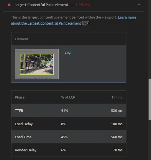
LCP (Largest Contentful Paint): This is a metric that measures page loading performance. It indicates the time when the largest content element within the viewport is rendered. This element is typically the main content (e.g., hero images, large text blocks, video posters, etc.) on the page; the faster the LCP, the faster users feel the page loads. The target is within 2.5 seconds.
-
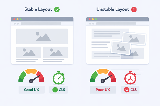
CLS (Cumulative Layout Shift): This is a metric that measures the visual stability of a page. It indicates the total amount of layout shifts that users experience unexpectedly. A typical example is when an image suddenly loads, pushing surrounding text or buttons down, which can lead to user click errors or confusion. The target is less than 0.1.
-
FID (First Input Delay): This is a metric that measures the interactivity of the page. It measures the time from when a user first interacts with the page (button clicks, link touches, etc.) to when the browser begins to respond to that interaction. The target is within 100 ms.
Among these, the width and height attributes have a direct impact on both LCP and CLS.
The Magical Effect of Specifying width and height Attributes
Specifying the width and height attributes in the <img> tag may seem very simple, but it fundamentally changes the rendering of images by the browser.
<img src="your-image.jpg" alt="Description of your image" width="800" height="600">
By adding these attributes, the following optimization effects can be achieved:
-
Improved LCP: The browser can predict the final size of the image based on the
widthandheightvalues before downloading the image and reserve that space in advance. This allows layout calculations to proceed without waiting for the image download. Consequently, the browser can manage the rendering process of the page more efficiently and show key content, including LCP elements, to the user more quickly. -
Prevented CLS: Since the space for the image is reserved in advance, there will be no layout shifts caused by surrounding content being pushed down when the image actually loads. This offers users a visually stable and pleasant experience and significantly improves the CLS score.
Utilizing browser aspect-ratio calculations:
Modern browsers internally calculate the aspect ratio of the image based on the width and height attributes and allow CSS to automatically adjust the height to maintain the aspect ratio, even if only the width is specified. This greatly helps in preventing CLS while handling images flexibly in responsive designs. Even when using CSS such as width: 100%; height: auto;, it's important to specify the width and height in HTML.

Practical Application Tips
-
Apply to All
<img>Tags: Make it a principle to specifywidthandheightattributes for all<img>tags used on webpages, without exception. This should be applied from user avatars to large hero images. In server-side rendering (SSR) environments like Django, you can easily implement this by using an image processing library likePillowto read the width and height of images within the view functions and pass these values dynamically to the templates for rendering in HTML. -
Use Actual Image Size: The specified
widthandheightvalues should ideally reflect the original pixel size of the image file. Even if you adjust this size via CSS, the HTML attributes should follow the actual pixel values. -
Harmony with Responsive Design: Use CSS properties like
max-width: 100%; height: auto;to ensure that images resize responsively to fit their parent elements. In this case, the HTMLwidthandheightprovide the necessary original ratio information for the browser to reserve space.
<style>
  .responsive-image {
    max-width: 100%;
    height: auto; /* Use with width/height attributes to maintain aspect ratio */
  }
</style>
<body>
  <img src="responsive-example.jpg" alt="Responsive Image" width="1200" height="800" class="responsive-image">
</body>
- Usage with
<picture>Tag: Even when providing images of various resolutions and formats usingsrcsetand<picture>tags, ensure that the internal<img loading="lazy">tag specifies thewidthandheightattributes.
Conclusion: Small Efforts, Significant Performance Gains
Specifying width and height attributes in image tags is one of the ways to achieve 'the greatest effect with the least effort' in web performance optimization. This simple habit can improve your website's LCP and prevent unnecessary layout shifts, thereby reducing the CLS and ultimately providing users with a faster and visually stable experience. As a developer, if you want to improve Core Web Vitals metrics and enhance user satisfaction, make it a top priority to add width and height to all <img> tags right now.


There are no comments.