Why Specifying Width and Height on the Image Tag Matters
When building a web page, one of the most frequently used tags is the <img> element. Yet, it’s still common to see images inserted with only a src attribute, leaving out size information.
Omitting dimensions can cause layout shifts during page load, negatively impacting user experience and performance metrics. In this post, we’ll explore why adding width and height to <img> is essential and the tangible benefits it provides from a technical standpoint.
1. Rendering Performance and Page Load Speed

1‑1. Ensuring Stable Layout
Browsers parse HTML and render the page as quickly as possible. If the size of an image is unknown, the browser can’t pre‑allocate the space the element will occupy.
As a result, when the image loads, it pushes existing content, causing an unintended layout shift.
<img src="photo.jpg">
In this scenario, the element is treated as having no height until the image loads, after which the layout is recalculated.
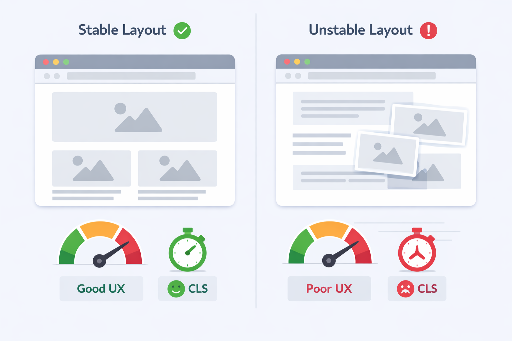
1‑2. Reducing Cumulative Layout Shift (CLS)
CLS is one of Google’s Core Web Vitals that quantifies unexpected layout movement during page load.
By specifying width and height, the browser can calculate the exact aspect ratio before the image loads and reserve the necessary space.
CLS Guidelines
- CLS ≤ 0.1 : Good
- CLS ≥ 0.25 : Needs improvement
Declaring image dimensions is one of the simplest yet most effective ways to lower CLS.
1‑3. Accurate Understanding of Network Bandwidth
A common misconception is that setting width and height reduces the file size of the downloaded image.
- The browser still downloads the original image.
width/heightare only used for layout calculations.
Actual bandwidth savings come from:
- Using
srcset/sizes - Server‑side image resizing
- Employing the
<picture>element
However, declaring dimensions stabilizes the rendering process, improving perceived load performance and visual polish.
2. Accessibility Benefits
2‑1. Predictable Reading Flow
While the alt attribute is central to accessibility, layout stability also plays a supportive role.
Clear image dimensions make the page structure predictable, preventing abrupt changes in content flow for screen reader users and enhancing overall experience.
widthandheightthemselves aren’t mandatory for accessibility, but layout stability indirectly improves it.
2‑2. Predictable Layout on Mobile
Mobile screens are limited in size, so even minor layout changes are highly noticeable.
Without specified dimensions, content may shift during loading or when zooming, disrupting the user’s visual rhythm.
Defining the image’s base ratio mitigates this instability.
3. SEO Perspective
Search engines value page loading performance and user experience.
- Low CLS pages
- Pages with stable initial rendering
These characteristics signal high‑quality content to search engines, potentially boosting rankings. Clear image structure also aids search engines in understanding the page and can positively influence image search results.
4. Practical Code Examples
4‑1. Size‑Unspecified (Problematic Example)
<img src="https://example.com/photo.jpg" alt="Beautiful scenery">
4‑2. Size‑Specified (Recommended Example)
<img
  src="https://example.com/photo.jpg"
  alt="Beautiful scenery"
  width="800"
  height="600">
Notes
widthandheightshould be pixel values in HTML attributes.- For responsive layouts, pair with the following CSS.
img {
  max-width: 100%;
  height: auto;
}
5. Quick Tips
| Situation | Recommended Approach |
|---|---|
| Static images | Specify width and height |
| Responsive | width/height + max-width: 100%; height: auto; |
| Dynamic | Insert dimensions server‑side based on metadata |
| SVG | Define aspect ratio with viewBox, add width/height if needed |
6. Conclusion
- Stable layout → lower CLS → better UX
- Predictable rendering → improved perceived performance
- Positive SEO signal
Specifying width and height isn’t just a coding nicety; it’s a foundational principle that simultaneously enhances web performance and user experience. Making it a habit when adding images can noticeably elevate the quality of your web pages.
Check out these related posts for front‑end engineers!


There are no comments.