daisyUI Color Names & Class Cheatsheet: The Essential Table for Theme Switching
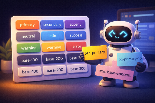
The main appeal of daisyUI is its ability to make theme switching effortless. That advantage disappears the moment a developer or designer hard-codes a fixed Tailwind color like bg-blue-500. Instead, by using daisyUI’s semantic color names—primary, base-100, error, etc.—and applying them as btn-primary, bg-base-200, text-error, the entire UI tone follows the theme automatically when you change it.
The key is knowing the color names and class patterns and combining them in your markup. Experienced designers may already have them in muscle memory, but for beginners or backend/full‑stack developers who touch UI occasionally, keeping this cheatsheet handy is far faster than hunting through documentation. This post is built for exactly that purpose, neatly tabulating when to use each color name and how to pair it with the right class.
Color Names (When to Use)
| Color name | When to use (brief) | Typical usage |
|---|---|---|
primary |
Brand’s main theme color | Main buttons, core CTAs |
primary-content |
Text/icons on primary |
Text on primary buttons |
secondary |
Secondary action / sub‑brand | Sub‑buttons, secondary emphasis |
secondary-content |
Text/icons on secondary |
Text in secondary areas |
accent |
Highlight / point of interest | Badges, link highlights, accent elements |
accent-content |
Text/icons on accent |
Text over accent background |
neutral |
Neutral UI (dark tone) | Navigation, footer, deep‑tone panels |
neutral-content |
Text/icons on neutral |
Text in neutral areas |
base-100 |
Default page background | Page/canvas background |
base-200 |
Slightly elevated surface | Cards, section backgrounds |
base-300 |
Stronger separation / layer | Dividers, deep panels |
base-content |
Text/icons on base series | Default body text |
info |
Information / guidance | Info banners, hints |
info-content |
Text/icons on info |
Text over info background |
success |
Success / normal | Completion / success alerts |
success-content |
Text/icons on success |
Text over success background |
warning |
Warning / caution | Warning messages, confirmation needed |
warning-content |
Text/icons on warning |
Text over warning background |
error |
Error / danger | Failure / error / destructive actions |
error-content |
Text/icons on error |
Text over error background |
Class Patterns (Combining Color Names)
| Purpose | Pattern | Example |
|---|---|---|
| Background color | bg-{COLOR} |
bg-primary, bg-base-200 |
| Text color | text-{COLOR} |
text-base-content, text-error |
| Border | border-{COLOR} |
border-neutral, border-base-300 |
| Gradient start/middle/end | from- / via- / to-{COLOR} |
from-primary via-accent to-secondary |
| Ring (focus) | ring-{COLOR} |
ring-primary |
| Ring offset | ring-offset-{COLOR} |
ring-offset-base-100 |
| SVG fill | fill-{COLOR} |
fill-accent |
| SVG stroke | stroke-{COLOR} |
stroke-neutral-content |
| Shadow | shadow-{COLOR} |
shadow-primary |
| Outline | outline-{COLOR} |
outline-info |
| Divider | divide-{COLOR} |
divide-base-300 |
| Form accent | accent-{COLOR} |
accent-primary |
| Caret | caret-{COLOR} |
caret-primary |
| Underline/Decoration | decoration-{COLOR} |
decoration-accent |
| Placeholder | placeholder-{COLOR} |
placeholder-base-content |
Adjusting Opacity
| Purpose | Pattern | Example |
|---|---|---|
| Light background | bg-{COLOR}/10 |
bg-primary/10, bg-success/15 |
| Subtle border | border-{COLOR}/30 |
border-error/30 |
| Faint text | text-{COLOR}/70 |
text-base-content/70 |
| Hover intensity | hover:bg-{COLOR}/80 |
hover:bg-primary/80 |
To tweak a color’s intensity, append
/{number}(percentage) to the class. Overriding the provided color names is fine, but adding arbitrary colors in HTML breaks design consistency and can cause theme‑switching issues. It’s best to stick to the semantic names.
Related posts: