# 10 Color, Stroke, and Shadow Combinations for Beautiful, Readable Subtitles and Titles
When creating subtitles or title overlays in Kdenlive, font choice varies, but **readability depends largely on the combination of color, stroke, shadow, and a background rectangle**. Below is a list of combinations I frequently use, each with a nickname and ready‑to‑apply values.
> Reference: 1080p (Full HD).
> Titles should be **larger and bolder**, while subtitles can be **slightly thinner** for a natural look.
---
## Quick Kdenlive Tips (Short and Practical) {#sec-98828eb7d32e}
* **Stroke thickness**
* Subtitles (small text): `2-4px`
* Titles (large text): `4-10px`
* **Shadow**
* Usually `offset 2-6px`, `blur 6-18px`, `opacity 40-70%` works well.
* **Background rectangle**
* When the video is complex, a **semi‑transparent box** is more reliable than a shadow.
* Commonly `black (#000000) 35-60%` + rounded corners.
* **Color selection principle**
* Contrast (lightness difference) with the background comes first, not just “pretty colors”.
* In practice, **bright text + dark stroke** is the most reliable choice.
---
## 10 Recommended Combinations (Nickname + Settings) {#sec-c6d69ccacceb}
The values below are starting points. Tweaking the thickness (px) and opacity (%) slightly based on the video’s brightness can significantly improve the result.
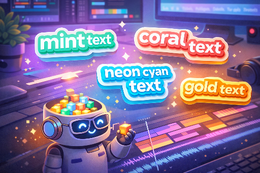
| Alias | Use / Feel | Main Text | Stroke (color/thickness) | Shadow (color/offset/blur/opacity) | Background Box (alternative) | Preview |
|---|---|---|---|---|---|---|
| **Noir Pop** | Most common YouTube subtitle | `#FFFFFF` | `#111111 / 3px` | `#000000 / (3,3) / 12 / 55%` | None | |
| **Cinema Gold** | Movie trailers / highlights | `#F5C542` | `#1A1A1A / 5px` | `#000000 / (4,4) / 16 / 60%` | Black 35% | |
| **Mint Tech** | IT / tutorial tone | `#38E8C6` | `#0B2B2A / 4px` | `#000000 / (3,3) / 14 / 50%` | Black 30% | |
| **Coral Punch** | Shorts / reactions / variety | `#FF5A6E` | `#2A0B10 / 4px` | `#000000 / (3,3) / 12 / 55%` | Black 35% | |
| **Sky Clean** | Bright vlogs | `#EAF6FF` | `#0B1B2B / 3px` | `#000000 / (2,2) / 10 / 45%` | Black 25% | |
| **Lavender Calm** | Emotional / review / ASMR | `#CDB7FF` | `#1C1630 / 3px` | `#000000 / (2,3) / 14 / 45%` | Black 30% | |
| **Neon Night** | Games / cyber / night scenes | `#00F5FF` | `#0B0F14 / 5px` | `#000000 / (4,4) / 18 / 65%` | None (use thicker stroke) | |
| **Paper Caption** | Documentary / education / news | `#F2F0E6` | `#2B2B2B / 2px` | `#000000 / (2,2) / 8 / 40%` | `#000000 45%` (recommended) | Paper Caption |
| **Sports Banner** | Highlight subtitles / keywords | `#FFFFFF` | `#0B0B0B / 6px` | `#000000 / (4,4) / 14 / 60%` | Solid box (team color 55%) | Sports! |
| **Minimal Graybox** | Safe for any video | `#FFFFFF` | None or `#000000 / 1~2px` | Light: `#000 / (2,2) / 8 / 35%` | `#000000 50%` + rounded | Minimal Graybox |
---
## Five Design Secrets for “Good Design” {#sec-2166ee8e6dcc}
1. **Highlight only keywords with color**
* Instead of coloring the entire sentence, using a point color like `Mint Tech` or `Coral Punch` for key words gives a more sophisticated look.
2. **A 1px increase in stroke feels significant**
* To boost subtitle impact, the quickest fix is usually **adding 1px to the stroke**.
3. **For complex backgrounds, a box is more reliable than a shadow**
* n detailed scenes such as forests, cityscapes, or game UIs, `Minimal Graybox` is usually the safest choice.
4. **Different settings for top titles vs bottom subtitles**
* Top titles: thick stroke (4~8px), strong shadow.
* Bottom subtitles: stroke 2~4px, box 40~55% opacity.
5. **Don’t insist on white only**
* Warm indoor lighting or vlogs benefit from `Paper Caption` (off‑white) to reduce eye strain.
---
## Quick Selection Guide {#sec-1f4b7012011e}
* **If you’re new:** `Noir Pop` or `Minimal Graybox`
* **IT/tech vibe:** `Mint Tech`
* **Emotional / review:** `Lavender Calm`
* **Highlight / variety:** `Coral Punch`, `Sports Banner`
* **Games / neon:** `Neon Night`
* **Doc / education:** `Paper Caption`
---